Stock-bond correlation: an old model and a new regime
Stock-bond correlation is one of the oldest topics in asset allocation, and it keeps coming back for a reason. No surprise: it’s a key input for modern portfolio construction.
For decades, bonds have played the role of natural diversifier in investors’ portfolios, nurturing traditional allocations like the 60/40. On the other side, correlations move relatively slowly compared to returns or volatility, making them stable enough to anchor strategies like risk parity and maximum diversification.
But none of this is taken for granted. Since the pandemic, stock-bond correlation has flipped positive for the first time in twenty years with a continuing momentum. The diversification a stock-bond portfolio is supposed to deliver is fading, and strategies that rely on stable correlations are under real pressure. It’s a good time to revisit this old question.
A Mental Model
There is no shortage of well established models for estimating correlation. DCC-GARCH decomposes the covariance matrix to volatility and correlation for their respective dynamics. Regime switching and hierarchical clustering models try to capture a nonlinear aspect of the association. Even a plain rolling sample correlation works reasonably well for its slow moving nature. But when I want to actually make sense of stock-bond correlation, the mental model I keep coming back to is from Ilmanen’s 2003 paper.
The model starts from a surprisingly simple and intuitive place: the discounted cash flow pricing. Both stocks and bonds, like any other asset, are priced as the expected present value of their future cash flows. Naturally, the crux of stock-bond correlation comes down to what stocks and bonds share and what they don’t in their cash flows and discount rates.
With a bit of simplification, a bond pays fixed coupon (C) while a stock pays a stream of uncertain dividends (D) that varies with economic growth (G). On the discounted rate side, stock and bond share a bond yield part (Y) while sotck also carries its unique equity risk premium (ERP).
\[\begin{aligned} P_{\text{stock}} &= E[\sum_{t=1}^{\infty} (\dfrac{1+G}{1 + Y_t + \text{ERP}_t})^t D] \\ P_{Bond} &= E[\sum_{t=1}^T \dfrac{C}{(1+Y_t)^t} + \dfrac{100}{(1+Y_T)^T}] \end{aligned}\]Now things become much clearer. The shared yield Y sits in both denominators, moving stock and bond prices in the same direction. That’s what pushes correlation up. The other two pieces, growth G and the equity risk premium ERP, only show up in the stock formula. When G or ERP moves, stock and bond prices start to decouple, pushing correlation down.
The analysis would have ended neatly here if all these variables were exogenous and independent. But they’re not. There are probably no variables more endogenous than bond yield and equity risk premium, since the concepts come directly from valuation itself. Bond yield also co-moves with economic growth through channels like monetary policy, long term growth expectation and financial conditions. To go further, Ilmanen (2003) takes the analysis one level deeper, to two more fundamental drivers: growth and inflation.
Inflation builds into the bond yield Y directly. When inflation rises, Y rises, and the discount rate goes up for both stocks and bonds. Both prices fall together. So at times when inflation is the focus of the market, stock and bond prices tend to move in the same direction, which means high correlation. On the other hand, growth works differently. Better growth lifts stock prices by raising expected dividends D. But it also lifts Y through monetary policy and long-term rate expectations, which hurts bond prices. So growth pushes stocks up and bonds down at the same time. At times when growth is the dominant story, stock and bond prices tend to decouple, and correlation falls.
Putting it to work: 3 regimes of history
A straightforward and intuitive mental model! What’s even better, it turns out to explain a lot of what has happened and what’s happening now.
Looking at the beginning of the modern era, the last three decades of the 20th century were marked by huge inflation volatility. Two oil shocks in the 1970s pushed inflation sharply higher. Then Volcker came in and fought it with brutal rate hikes, kicking off two decades of declining inflation through the 1980s and 1990s as the Fed slowly rebuilt its credibility. Inflation was the loudest noise in the room throughout. No surprise that US stock-bond correlation stayed firmly positive over this period, ranging from +0.3 to +0.5.
Things started to change as we entered the 21st century. Deepening globalization brought in cheap goods supply from emerging market producers. With that tailwind, central banks earned enough credibility to keep inflation anchored around target. For the first time in a while, inflation stopped being a concern. Growth expectations took over as the main headline instead. The major events of the period, dotcom bubble, financial crisis, China slowdown, were all about growth. As the model would predict, we got 20 years of clean diversification from a negative correlation.
Things flipped again in the 2020s, triggered initially by the pandemic and sustained by the continuing deglobalization and geopolitical uncertainty. We’re past the good old days when inflation wasn’t a concern. As of March 2026, US CPI inflation is running at 3.3%, well above the 2% target and showing no clear path back down yet. Inflation, the variable that touches everyone’s daily life, is back as the dominant headline. No surprise we’re in a new era of positive stock-bond correlation.
In a following paper “A Changing Stock-Bond Correlation”, Brixton, Ilmanen et al. (2023) quantify this story by splitting the 1972 to 2022 history into growth and inflation regimes. The pattern is clear: inflation news moves stocks and bonds in the same direction, while growth news pushes them apart. They formalize this in a regression with three variables: growth volatility, inflation volatility, and the correlation between growth and inflation news. The model captures around 70% of the variation in US stock-bond correlation, with similar results across major developed markets.
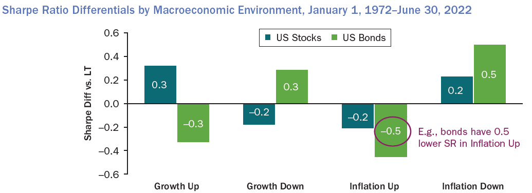
Brixton, Ilmanen etc (2023): A Changing Stock-Bond Correlation
A Little More
This is the kind of model I enjoy reading. It’s grounded in solid economic meaning and focuses on what really matters out of a sea of variables. Readers benefit a lot from working through and reasoning with it.
But like any model, it’s not perfect. A few things sit outside its simple and intuitive frame. The simplifications focus on sovereign bonds and equity, leaving credit and other risk premia out. It also doesn’t speak to cases where central banks control the yield curve directly through QE or yield curve control, which is another important driver of yield curve moves. And because it leans on long-term variables like inflation and growth, it doesn’t say much about short or medium-term moves in correlation.
Adding more structures helps handle these scenarios. For example, instead of treating the bond yield as a single shared component in the discount rate, we can break it into more granular pieces. Splitting it into real risk-free rate, expected inflation, and term premium helps in a few ways. Pulling the real rate apart from inflation lets us think about monetary policy that’s doing more than just fighting inflation, like QE or yield curve control. Adding a term premium gives us the flexibility to think about the curve shape and account for assets with different durations. The asset-specific risk premium then naturally absorbs credit spreads for corporate bonds, FX impact for EM bonds, and the equity risk premium for stocks, which extends the framework to a wider set of asset pairs.
Similarly, the cash flow growth can be decomposed into real growth and expected inflation. This matters because inflation passes through to different assets’ cash flows in very different ways. Stocks in the energy sector can often pass inflation through to revenues directly, leading to dividend growth that tracks inflation more closely. Utilities and regulated industries sit at the other end, where pricing is constrained and cash flows can’t keep up with inflation.
\[\begin{aligned} \text{discount rate} &= \text{real risk free rate} + \text{expected inflation} + \text{term premium} + RP^{asset} \\ g &= \text{real growth} + \text{expected inflation} \end{aligned}\]A lot more structures can be added like this, though they trade off some of its simplicity as a cost. Though it’s still good to have the option to get the version that matchs the taks at hand.
Closing Marks
Finally, I’d like to come back to the original mental model for a proper close. Standing where we are now, it’s interesting to see a framework laid out in 2003 explains why correlation had just turned negative, and still works well two decades later when correlation flipped back positive after 2020. The same mechanism, two opposite regimes. Let’s take this mental model with us and watch what comes next, and see whether the negative correlation of the 2000s and 2010s turns out to have been a rare anomaly as some believed, or whether another regime change is coming sooner than we expect.
Reference
- Antti Ilmanen (2003): Stock-Bond Correlation
- Brixton, Ilmanen et al (2023): A Changing Stock-Bond Correlation